The Subtlety of Saffron: The Psychology of Color in South Asian Packaging
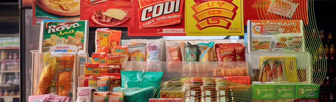
Color is never just a shade; it's a whisper of culture, a flash of emotion, and, crucially for brands, a powerful silent salesperson. In the vibrant, diverse, and impulse-driven markets of South Asia (encompassing countries like Nepal, India, Pakistan, Bangladesh, and Sri Lanka), the psychology of color in product packaging is not just a branding strategy — it's a necessity for survival. Here, cultural, religious, and age-based nuances elevate color selection from a design choice to a critical marketing decision, especially for FMCG (Fast-Moving Consumer Goods) and Lifestyle Products.
Cultural & Religious Context: The Color Language of South Asia
Western color psychology often falls short in the South Asian context, where centuries of tradition imbue colors with deep, shared meanings that directly influence consumer trust and purchase intent.
| Color | South Asian Cultural Association | Packaging Implication |
|---|---|---|
| Red 🔴 | Purity, fertility, love, celebration, power (auspicious). | High-energy FMCG (spices, tea, snacks), bridal or festive products. Impulse buy driver due to its high-arousal effect. |
| Yellow 🟡 | Auspiciousness, wealth, knowledge, new beginnings (linked to the turmeric ritual). | Premium or Lifestyle products, dairy, and products promising prosperity or purity. Often paired with Red for festive appeal. |
| Green 🟢 | Nature, fertility, growth, healing, life. Sacred in Islam. | Healthy food, natural/herbal FMCG (especially hygiene products), and packaging seeking to convey freshness or eco-friendliness. |
| Blue 🔵 | Trust, calmness, divinity (associated with Lord Krishna and Lord Shiva). | Water/beverages, electronics, and brands aiming for dependability and logic. Darker blues convey sophistication. |
| White ⚪ | Purity, peace, simplicity. However, often associated with mourning/funerals. | Used carefully for high-end Lifestyle and Health products to denote cleanliness and premium status. |
| Purple 🟣 | Royalty, spirituality, luxury, indulgence. | Premium chocolates/confectionery (FMCG), luxury Lifestyle items (cosmetics). Appeals strongly to young and female demographics. |
Missteps in this region can be costly. While Red might signal “danger” in the West, in South Asia, its celebratory and powerful connotations make it a primary choice for high-visibility FMCG products meant for quick selection.
Product Category Nuances: FMCG vs. Lifestyle
FMCG (Impulse-Driven)
- Warm, vibrant colors (Red, Orange, Yellow) dominate. They grab attention and signal immediate energy, taste, and excitement.
- Green and White are increasingly used for “virtue foods” (healthy snacks, organic items) to signal health and natural ingredients.
Lifestyle Products (Perception-Driven)
- Black, Gold, and Dark Blue/Purple communicate elegance, sophistication, and luxury.
- Muted tones and minimalist White align with modern trends, appealing to the urban, globally-exposed consumer.
Age Category: Tailoring the Spectrum
The Youth (Gen Z, 15–22 Years)
- Bright, high-saturation, and contrasting colors (e.g., neon, pinks, electric blues) are highly effective.
- They respond well to Purple and bold, unconventional designs.
Young to Middle Adults (23–45 Years)
- Mid-range saturation and classic combinations like Blue (trust) and Green (health/nature) work best.
- Subtle cues like matte finishes or metallic accents suggest established quality without being flashy.
Older Adults (46+ Years)
- Prefer clear, legible designs with traditional color meanings (e.g., Yellow for purity, Red for high-quality spices).
- Value familiarity and function over visual experimentation.
The Takeaway
In South Asia, successful packaging design is a mastery of balancing global trends with local sensitivities. The right shade of saffron or the perfect hint of emerald can be the difference between a product that gets noticed and one that disappears into the bustling marketplace. Brands must remember that in this complex region, every color choice carries the weight of history, culture, and consumer aspiration.
Are you in touch with your brand?
At WaterComm, we help our clients build innovative and inspiring brand that are genuinely rich, powerful, relevant with lasting customer relation.